 |
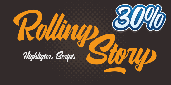
Rolling Story is a highligter script, connecting script that can appear both retro and contemporary. Suitable for design, element design, fashion blogs, vintage, wedding, event, t-shirt, logo, badges, sticker, and awesome work, and more.
 |
Rolling Story is a highligter script, connecting script that can appear both retro and contemporary. Suitable for design, element design, fashion blogs, vintage, wedding, event, t-shirt, logo, badges, sticker, and awesome work, and more.
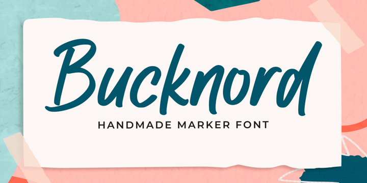 |
Bucknord is a cool and playful handmade marker font. This font is designed to help your needs such as logos, product packaging, invitations, branding, headlines, signage, labels, book covers, posters, quotes, and more.
 |
Bucknord is a cool and playful handmade marker font. This font is designed to help your needs such as logos, product packaging, invitations, branding, headlines, signage, labels, book covers, posters, quotes, and more.
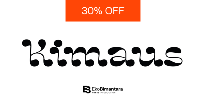 |
Kimaus is reverse contrast display font. It's letterforms are inspired by the classic cartoon style. Fit for titling and unique looking designs and creative projects.
 |
Kimaus is reverse contrast display font. It's letterforms are inspired by the classic cartoon style. Fit for titling and unique looking designs and creative projects.
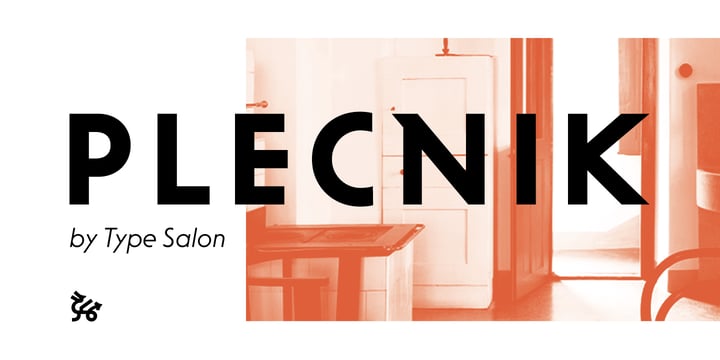 |
This typeface follows the principles of the numerous and diverse architecture and graphic design works from the most famous Slovene architect Jože Plečnik, and so unfolds a piece of Slovene’s rich, yet still undiscovered typographic legacy.
Typeface Plecnik is defined by classical elements and shapes. With classic proportion, humanist stroke endings and low contast, Plecnik comunicates a modern, elegant and sophisticated message. Due to Plecnik's recognisable shapes the typeface remaines memorable and irreplaceable. When used for book and editorial designs, branding, packaging or display, Plecnik will perform in its purpose. Designed in four weights and accompanied with italics, Plecnik also offers a Display style, which is even more distinctive and perhaps even more attributable to Plečnik.
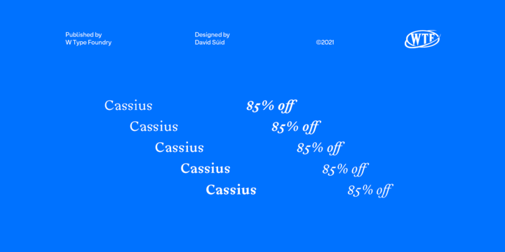 |
Cassius & Cassius Italic are a postmodern typeface system from the Garaldes family.
The main characteristic of this type family is its inverted anatomy and projected terminals. Cassius was meticulously designed with special focus on its structure. With its proposal for a fresh, attractive and rhythmic system, Cassius gives great personality to all kinds of composition.
The family consists of 5 weights from regular to black, with respective Italics. Each instance includes; Case sensitives Accents, Ligatures, Fractions, Small Caps, Old Style Figures, Case Sensitives (symbols and punctuation) and more.
This font is perfect for books and magazines compositions, and in general for the construction of immersive printed or digital texts.
 |
©
Angela Biryukova
2014 . Powered by
Blogger
Blogger Templates
.
.